If you’re looking for a way to create product tables in your WooCommerce store then this guide is for you. Here I’m telling you about the best plugin for creating tables for your WooCommerce products from my experience.
Tag » Responsive
10 Tips to Improve Your E-Commerce Website Design
The key to a successful website is its design and responsiveness, especially if it is an E-Commerce website. Unlike lifestyle blogs or infotainment sites, eCommerce sites are quite tricky to design. Apart from working on the quality of your products, you also need to make it extraordinarily user friendly.
Bootstrap Off-canvas Menu and Sidebar with or without Overlay
Previously we have created Bootstrap off-canvas menu and sidebar. Further, the code was quite handy for WordPress websites. However, Bootstrap offers better accessibility and support for screen readers and similar assistive technologies.
Bigger Search Form with Drop-down in Navigation Bar
Websites that use Bootstrap 4 framework, sometimes need a bigger search form in the navigation bar. These websites might also need a drop-down or select input to provide better search. Create a navigation bar consists of a bigger search form.
Contact Form 7 Radio and Checkbox in Bootstrap 4 Style
Are you using Contact Form 7 plugin in a WordPress website using a theme built with Bootstrap front-end framework? Then you must have faced styling issues in CF 7 inputs in accordance with Bootstrap.
Bootstrap 4 Carousel Full-screen Background Slider – PHP
Bootstrap 4 offers carousel integration with slide and fade effects. We can turn the Bootstrap 4 carousel in a full-screen slider with help of available classes and custom rules. Mostly you can see them as background image responsive sliders that cover the entire viewport.
How to Use Individual JavaScript Plugin in Bootstrap
You can use individual JavaScript plugin in Bootstrap framework also, rather using whole Bootstrap JS file built on jQuery. Once I had need to include only Navbar component which depends on Collapse JavaScript plugin from Bootstrap.
Mega Menu – Multi Column Container in Bootstrap 4 Nav Dropdown
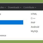
Want to convert a Bootstrap 4 nav menu dropdown to a multi column container or mega menu? Or need a navbar that breaks navigation links into responsive Bootstrap 4 columns, even in WordPress. Check the attached image to know what I have meant.
Responsive Modal or Popup – only CSS and Animation
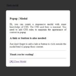
Responsive modal or popup are common features in a web application. They are used to show extra information or a form on the same page as popup above existing content upon clicking to a link or button. This article will help you to create a responsive modal or popup with CSS only.
I have also explained this pure CSS concept along with. So that you can understand how does this thing work. It will help you to change the CSS rule to organize responsive modal in your own way.
Placing text above foreground image in html
It’s quite common to use background image and place text above it but it’s also possible to use image in foreground and place text above foreground image overlay. You can also horizontal center or vertical center the text as explained in the article.
So our page contains a piece of HTML as follow:


