Responsive modal or popup are common features in a web application. They are used to show extra information or a form on the same page as popup above existing content upon clicking to a link or button. This article will help you to create a responsive modal or popup with CSS only.
I have also explained this pure CSS concept along with. So that you can understand how does this thing work. It will help you to change the CSS rule to organize responsive modal in your own way.
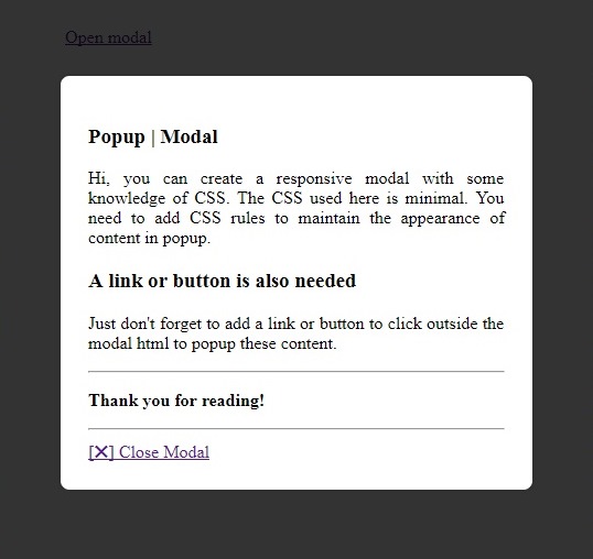
Responsive Modal or Popup – HTML
First of all write the modal html.
1 2 3 4 5 6 7 8 9 10 11 12 13 14 15 16 17 18 19 20 21 22 23 24 25 | <!-- Start Modal --> <div class="ft-modal" id="ft-demo-modal"> <div class="ft-modal-content"> <div class="ft-modal-header"> <div class="header"> <h3>Popup | Modal | PURE CSS</h3> </div> </div> <div class="ft-modal-body"> <p align="justify">Hi, you can create a responsive modal with some knowledge of CSS. The CSS used here is minimal. You need to add CSS rules to maintain the appearance of content in popup.</p> <h3>A link or button is also needed</h3> <p align="justify">Just don't forget to add a link or button to click outside the modal html to popup these content.</p> <hr> <p><strong>Thank you for reading!</strong></p> <hr> </div> <div class="ft-modal-footer"> <a class="ft-modal-close" href="#">[✖] Close Modal</a> </div> </div> </div> <!-- End Modal --> <!-- Link in page to show modal on click--> <a href="#ft-demo-modal">Open modal</a> |
Here is a sample of html. Also don’t forget to place a link somewhere in your page which will trigger the responsive modal upon click. I have put Line #25 out of the popup html for the same.
Do you know, you can use same Bootstrap modal as popup as well as render it as direct content on a page when you need it to be there but not as popup. The article http://fellowtuts.com/twitter-bootstrap/modal-popup-direct-page-content/ has explained this.
The most important thing is place the modal html either in just beginning of body or just before closing body tag (outside page wrapper). So that your modal appearance won’t get influenced by CSS of the container or any parent wrapper holding regular page content.
Responsive Modal or Popup – The CSS
You need to place the following minimal CSS in your .css file or in between style tag of head section.
1 2 3 4 5 6 7 8 9 10 11 12 13 14 15 16 17 18 19 20 21 22 23 24 25 26 27 28 29 30 31 32 33 34 35 36 37 38 39 40 41 42 43 | .ft-modal { top: 0; left: 0; right: 0; bottom: 0; opacity: 0; z-index: 9999; overflow: auto; position: fixed; visibility: hidden; margin-top: -250px; background: rgba(0,0,0,.8); transition: all .3s ease-in-out; -moz-transition: all .3s ease-in-out; -webkit-transition: all .3s ease-in-out; } .ft-modal:target { opacity: 1; margin-top: 0px; visibility: visible; } .ft-modal-content { width: 70%; padding: 25px; background: #FFF; max-width: 600px; margin: 70px auto; position: relative; border-radius: 8px; box-shadow: 0 0 6px rgba(0, 0, 0, 0.2); } /* .ft-modal-close { top: 9px; right: 12px; float: right; position: absolute; } */ |
Here is the minimum CSS required to control responsive modal. You might need additional rules to organize content inside popup. Duh! your theme would be already playing them fine. Right? 😶
If you want to put modal close button at top right, just uncomment line #36 to 43.
Read: Create different shapes only with CSS.
Now all is done. Just hit the link or button we’ve already created to pop the modal. Also resize your browser to test the responsiveness. Hope you’re feeling excited!
Responsive Modal or Popup – CSS Explanation
Hey! It’s the most important part I think. You should know that how this CSS only solution is working to popup the responsive modal. Let’s understand major things.
The core class is ft-modal which content a full screen layer behind modal as well as content within. The overflow property handles modal scrolling if you have much content to show in this pure CSS based responsive modal.
The z-index is required to keep the modal layer above the regular page content.
The top margin is set to -250px and zero when targeted (in :target pseudo rule, read about pseudo selectors). It stats that when the modal will be targeted, it would give a nice Slide In animation from top, through the transition properties given. The opacity adds a smooth Fade effect in responsive popup animation.
A Bootstrap modal can hold a form but markup should be correct. Check Bootstrap Form in Modal for more detail.
The ft-modal-content class is modal content container. The max-width property ensures maximum width of responsive modal to 600px, no matter how wider the device is. Also given values of margin give 70px top distance from document upper boundary and same 70px form lower boundary if content within modal is much. The classic auto values for left & right margins brings the responsive modal to exact horizontal center.
You should play with width, max-width and margin property or can add more classes toft-modal-content div to have a big and a small sized modal. I leave it for you as exercise for this CSS only popup/modal.
Hope the solution above has made you understanding the responsive modal or pure CSS based responsive popup behavior. Your interest about CSS only responsive modal, feedback or questions are most welcome in comment.
What do I add to close modal when clicking on backdrop?
Nice Job Well Done