Here are 2 ways which you can use whenever you need to center a column div within `.container` in Twitter Bootstrap 3 as well as to keep empty space outside the `div` to be evenly distributed. First approach uses offset feature available in Bootstrap while it has a limitation and second approach is using `center-block` class with setting `float: none` in Twitter Bootstrap.
Tag » Responsive
Display Data in Responsive Columns from Database using PHP

As responsive design has come into trends, I decided to write this post to display Data in Responsive Columns from Database using PHP. Like the image below, a product catalog would be good example of this where columns adjust them automatically to maintain responsiveness with different screen sizes.
Bootstrap 3 sidebar nav fixed – responsive affix full example
This article is full example of responsive Affix in Twitter Bootstrap 3, which is placed in sidebar of your Bootstrap project as a navigation menu on the same page. You can implement code to place an affix in sidebar which maintains responsiveness and expands its width to full available size of parent container even if you resize the window or click any nav menu.
Responsive CSS framework or Bootstrap – navbar breaks on two line – fix
Bootstrap is popular HTML, CSS, and JS framework for developing responsive, mobile first projects on the web. I faced issue of Bootstrap navbar breaks on two line while designing interactive navbar header as you can see in picture below.

Creating a Responsive Multi Column List
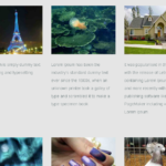
In this tutorial we are creating responsive multi column list which maintain predefined number of columns in each row regardless of device size. The last output of our tutorial will be like below with 3 responsive columns in each row. You can easily change it with 2,4,5 or more columns as per your requirement.
In a grid system you can maintain responsiveness where fluid container display grids of images, videos, text, and more. In our article we are doing the same but maintaining number of grids in each row.
[ Page 2 of 2 ]