This article is full example of responsive Affix in Twitter Bootstrap 3, which is placed in sidebar of your Bootstrap project as a navigation menu on the same page. You can implement code to:
Place an affix in sidebar which maintains responsiveness and expands its width to full available size of parent container even if you resize the window or click any nav menu.
Make affix invisible on small screen sizes (<768px) using Bootstrap’s ‘hiden-‘ classes.
Smoothly scrolls the page whenever you click any nav link using jQuery’s ‘animate()‘ function.
Apply a different class on currently active navigation menu and switch classes on manual scrolling.
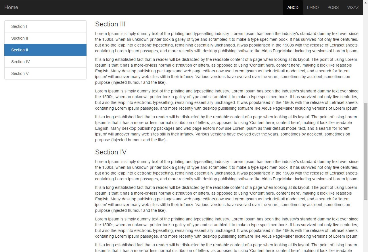
Bootstrap 3 sidebar nav fixed – responsive affix full example
The default affix provided in Bootstrap doesn’t expands to full available width of sidebar if you use fluid width or ‘container-fluid’ class (picture below). But our code will overcome this issue.

Furthermore for simplicity we are using fixed navbar at top of page and content below it. You can modify the code as per your specific requirement.
HTML: Below is the HTML of our page.
1 2 3 4 5 6 7 8 9 10 11 12 13 14 15 16 17 18 19 20 21 22 23 24 25 26 27 28 29 30 31 32 33 34 35 36 37 38 39 40 41 42 43 44 45 46 47 48 49 50 51 | <nav class="navbar navbar-inverse navbar-fixed-top" role="navigation"> <!-- YOUR TOP NAVBAR CODE--> </nav> <div class="container-fluid"> <div class="row"> <div class="col-sm-3 hidden-xs"> <!--Affix start--> <div data-spy="affix" data-offset-top="0"> <div class="list-group"> <a href="#section-1" class="list-group-item active">Section I</a> <a href="#section-2" class="list-group-item">Section II</a> <a href="#section-3" class="list-group-item">Section III</a> <a href="#section-4" class="list-group-item">Section IV</a> <a href="#section-5" class="list-group-item">Section V</a> </div> </div> <!--Affix end--> </div> <div class="col-sm-9"> <!--Content start--> <div class="wrapper"> <div id="section-1" class="section"> <h3>Section I</h3> <p>...</p> <p>...</p> </div> <div id="section-2" class="section"> <h3>Section II</h3> <p>...</p> <p>...</p> </div> <div id="section-3" class="section"> <h3>Section III</h3> <p>...</p> <p>...</p> </div> <div id="section-4" class="section"> <h3>Section IV</h3> <p>...</p> <p>...</p> </div> <div id="section-5" class="section"> <h3>Section V</h3> <p>...</p> <p>...</p> </div> </div> <!--Content end--> </div> </div> </div> |
Here you can see we have set ‘data-offset-top‘ to zero as we don’t have any element except navbar before affix and used ‘active‘ class to first nav link in sidebar affix. Since we have fixed navbar at top to we need body padding.
CSS:
1 2 3 | body { padding-top: 70px; } |
Now the menu will start normally without any smooth scrolling and fixed positioning. To achieve what we have mentioned in starting of article we need to add some jQuery code. So add the following script anywhere after already added jQuery library (as required by Bootstrap):
1 2 3 4 5 6 7 8 9 10 11 12 13 14 15 16 17 18 19 20 21 22 23 24 25 26 27 28 29 30 31 32 33 34 35 36 37 38 39 40 41 42 43 44 45 | jQuery(document).ready(function() { var offset = 70; // Function to handle affix width and classes in affix menu on page loading, scrolling or resizing function affix() { // Fit affix width to its parent's width var $affixElement = $('div[data-spy="affix"]'); $affixElement.width($affixElement.parent().width()); // Position of vertical scrollbar var position = $(window).scrollTop(); if (position >= offset) { $('.wrapper .section').each(function(i) { // Current content block's position less body padding var current = $(this).offset().top - offset - 1; // Add active class to corresponding affix menu while removing the same from siblings as per position) of current block if (current <= position) { $('a', $affixElement).eq(i).addClass('active').siblings().removeClass('active'); } }); } else { $('a', $affixElement).find('.active').removeClass('active').end().find(":first").addClass('active'); } }; // Call to function on DOM ready affix(); // Call on scroll or resize $(window).on('scroll resize', function() { affix(); }); // Smooth scrolling at click on nav menu item $('a[href*=#]:not([href=#])').click(function() { var target = $(this.hash); $('html,body').animate({ scrollTop: target.offset().top - offset }, 500); return false; }); }); |
The JS code is commented along with to let us understand what are the script performing. The first function is responsible to manage affix width and classes while resizing and scrolling where as the second function just utilize smooth scrolling whenever someone click to any on page affix navigation menu item in left sidebar.
This all is the full working example code for responsive affix with smooth scrolling in sidebar as fixed nav in your Bootstrap 3 project. If you need any modification then comment and let me know.
где демо пидор ?
not sure why, but this stuff works also without any JS at all.
I think somethings weird here 🙂
HI,
For first issue regarding hiding behind header: You can adjust body { padding-top: 70px; } and offset given in very first line in jquery document ready function.
For second issue regarding active class: make sure your jquery is being called.
For third issue working without jQuery: The default affix provided in Bootstrap doesn’t expands to full available width of sidebar if you use fluid width (not fixed one). You can also check by resizing & scrolling browser window.
Well, I solved issue “hiding behind header” with this:
http://stackoverflow.com/questions/30746706/bootstrap-affix-content-scrolls-to-far-up-on-screen/30747416#30747416
Issue with JS seems a issue with my way to add JS.
I use a visual composer to edit content, and it lets you add JS.
Seems, this JS does not apply somehow, no idea why
It resizes though, as this is a Bootstrap feature as I see in their DOC
Partially solved. The active class is anyway more of a scroll spy feature and Bootstrap actually seems to apply it to the affix too, but they do not state how.
Great, you have solve major issues. They didn’t mention but hope you can deal with that & still if you persist issue, we can assist you 🙂
also, I see that only now. the active class (add remove) seems not to work. Item one is always “active”
Great!
I just have one issue.
When you hit on a list group
item in sidebar, it scrolls correctly to the location, but actaully it
hides part of it exactly under the Headere Navigation.
It seems like the anchor is set to low (under post titlte) but, it’s not the case.
Wat settings can be changed to adjust the “margin-top” a certain element will have, once we “navigate” to it ?
Hope
you can understand .. Title of post is hiding under header menu,
instead of nicely scroll to the correct location, it scrolls to far “up”
on screen…
Hello – what adjustments can be made so that the list moves when the #footer scrolls to bottom of sidebar
Hello DS,
I’m sorry as I’m unable to get you. Footer is generally stays at bottom. Can you explain a bit more?