Twitter Bootstrap is powerful mobile first front-end framework that provides all the necessary components to develop responsive websites using its common elements. One of the most popular elements on any website is the top navigation bar and the search widget. On a recent project, I had to implement Bigger & Fixed Search Box with Dropdown in Bootstrap Navbar and making the search bar fixed across different screen size.
Category » Trending Posts
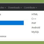
Mega Menu – Multi Column Container in Bootstrap 4 Nav Dropdown
Want to convert a Bootstrap 4 nav menu dropdown to a multi column container or mega menu? Or need a navbar that breaks navigation links into responsive Bootstrap 4 columns, even in WordPress. Check the attached image to know what I have meant.
Minlength validation in HTML 5 input
HTML 4 has maxlength attribute to limit the number of characters entered in input text box and HTML 5 also supports this attribute as well. HTML 5 input now supports minlength validation using pattern attribute. Let’s see how can we accomplish minimum length for a text box.
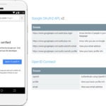
This App isn’t verified – Google OAuth Client Verification
When your web app requests certain sensitive OAuth scopes from Google, you must have passed Google OAuth Client Verification. Failing to do that, results “This App isn’t verified” page when a web client makes Google OAuth consent request.
Hide or remove controller name from url in Yii 2.0
You can hide or remove controller name from url in Yii 2.0 through configuring rules for urlManager component. You can hide controller name from url even if your pages are generated dynamically using database after reading this article.
First of all you have to enable pretty permalinks. After that let’s try to understand how to configure application rules by simple examples.
jQuery Expand Collapse with Plus Minus
Here is a simple jQuery Expand Collapse plug-in available to download. We have used plus/minus sign to expand/collapse content in this example and you can change them easily.
Moreover You can use nesting at any level. Clicking on anchor text to the left will take you to linked page/section. The final output will look like shown in image:
Display Data in Multiple Columns from Database using PHP
In some scenario we need to display data in multiple columns in a HTML table where each row from database keeps data for a single column. The data can be text, image or mixture of both. This article will guide you display data in multiple columns from database using PHP.
Bootstrap 3 sidebar nav fixed – responsive affix full example
This article is full example of responsive Affix in Twitter Bootstrap 3, which is placed in sidebar of your Bootstrap project as a navigation menu on the same page. You can implement code to place an affix in sidebar which maintains responsiveness and expands its width to full available size of parent container even if you resize the window or click any nav menu.
Social Login – All in One with Hybridauth 3 and CodeIgniter
Hybridauth is a quite popular library to integrate Social Login in PHP based applications including CodeIgniter. You can add the login/register feature from almost all social providers like Google, Facebook using it. Hybridauth 3 has a lot of improvements to integrate social Sign In/Up in PHP websites.
2 Ways for Hover Dropdown in Bootstrap 3 Navbar
The Bootstrap 3 css framework contains a pretty good navigation component called “navbar” which automatically collapse when the viewport is too small. The dropdown menu’s of the navbar open when clicking the main item. For a tablet or phone this behavior is fine, but when using a desktop you might want the menu’s to open when hovering them. So here we are discussing 2 Ways for Hover Dropdown in Bootstrap 3 Navbar.


