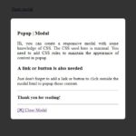
Responsive modal or popup are common features in a web application. They are used to show extra information or a form on the same page as popup above existing content upon clicking to a link or button. This article will help you to create a responsive modal or popup with CSS only.

I have also explained this pure CSS concept along with. So that you can understand how does this thing work. It will help you to change the CSS rule to organize responsive modal in your own way.

Read More

It’s quite common to use background image and place text above it but it’s also possible to use image in foreground and place text above foreground image overlay. You can also horizontal center or vertical center the text as explained in the article.

So our page contains a piece of HTML as follow:

Read More

Here are 2 ways which you can use whenever you need to center a column div within `.container` in Twitter Bootstrap 3 as well as to keep empty space outside the `div` to be evenly distributed. First approach uses offset feature available in Bootstrap while it has a limitation and second approach is using `center-block` class with setting `float: none` in Twitter Bootstrap.

Read More

When a page contains a large amount of content, the footer is pushed down off the viewport, and if you scroll down, the page ‘ends’ at the footer. However, If the page has small amount of content, the footer can sometimes ‘cling’ to the bottom of the content, floating halfway down the page, and leaving a blank space underneath, which looks ugly. So we need to make the footer stick to the bottom of page (not always fixed and visible).

Read More

Twitter Bootstrap has 12 columns grid layout by default which allows you to create responsive layout for your website but you can’t create 5 equal columns without using offset in this setup as sum of those column never meet with 12. But in this tutorial we have created some CSS rules to make five equal columns Bootstrap grid layout. Furthermore you can also have 1/5, 2/5, 3/5 and 4/5 sized columns combined with Bootstrap 12 columns grid layout after reading this post.

Read More

The Bootstrap 3 css framework contains a pretty good navigation component called “navbar” which automatically collapse when the viewport is too small. The dropdown menu’s of the navbar open when clicking the main item. For a tablet or phone this behavior is fine, but when using a desktop you might want the menu’s to open when hovering them. So here we are discussing 2 Ways for Hover Dropdown in Bootstrap 3 Navbar.

Read More

Twitter Bootstrap is being used popularly due to its powerful responsive front-end capabilities. One among its components ‘Panel’ is used for accordion and we can expand or collapse its body content by clicking on link inside panel heading. But I wanted to expand collapse panel with toggle icon in Bootstrap which are placed on right side inside panel heading as shown in the image below and the icons get changed according to visibility of content in panel.

Read More

Twitter Bootstrap is a popular front-end framework to create responsive websites with some popular JavaScript plugins. Here is a workaround to change navbar color in Twitter Bootstrap 3 instead of using the two basic navbar colors (light one / dark one) available.

<!-- A light one -->
<nav class="navbar navbar-default" role="navigation"></nav>
<!-- A dark one -->
<nav class="navbar navbar-inverse" role="navigation"></nav>

Read More

[ Page 2 of 6 ]