
I’m submitting a quite handy function to apply WordPress Pagination in Bootstrap 4 Style. This function contains First/Last, Previous/Next, Current and total number of pages. You can use the code for pagination in your Bootstrap 4 powered WordPress theme. It works with Custom Post Types and hides First/Last, Previous/Next texts on small devices (viewport width < 768 px)
Category » Tw. Bootstrap
2 ways to center a column in Twitter Bootstrap 3
Here are 2 ways which you can use whenever you need to center a column div within `.container` in Twitter Bootstrap 3 as well as to keep empty space outside the `div` to be evenly distributed. First approach uses offset feature available in Bootstrap while it has a limitation and second approach is using `center-block` class with setting `float: none` in Twitter Bootstrap.
Display Data in Responsive Columns from Database using PHP

As responsive design has come into trends, I decided to write this post to display Data in Responsive Columns from Database using PHP. Like the image below, a product catalog would be good example of this where columns adjust them automatically to maintain responsiveness with different screen sizes.
Bootstrap Popover and Tooltip not working with AJAX content
With already present elements in HTML these Bootstrap JavaScript Plugins work fine but not with dynamically loading AJAX content. This article here explains the reason behind Bootstrap Popover and Tooltip not working with AJAX content and the way to let them work.
5 equal columns Bootstrap grid layout with 1, 2, 3, 4 of five
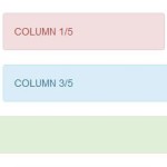
Twitter Bootstrap has 12 columns grid layout by default which allows you to create responsive layout for your website but you can’t create 5 equal columns without using offset in this setup as sum of those column never meet with 12. But in this tutorial we have created some CSS rules to make five equal columns Bootstrap grid layout. Furthermore you can also have 1/5, 2/5, 3/5 and 4/5 sized columns combined with Bootstrap 12 columns grid layout after reading this post.
Drag n Drop Multiple AJAX Images Upload with Progress Bar

AJAX is an important part in web development. This blog post covers steps to handle AJAX image upload with progress bar in Bootstrap with drag n drop feature. Some cool features in these steps are.
2 Ways for Hover Dropdown in Bootstrap 3 Navbar

The Bootstrap 3 css framework contains a pretty good navigation component called “navbar” which automatically collapse when the viewport is too small. The dropdown menu’s of the navbar open when clicking the main item. For a tablet or phone this behavior is fine, but when using a desktop you might want the menu’s to open when hovering them. So here we are discussing 2 Ways for Hover Dropdown in Bootstrap 3 Navbar.
Auto close alert in Twitter Bootstrap with AJAX
Twitter Bootstrap provides alerts in different style to give user some messages regarding his actions and he/she can then close the alert manually later. But there is not functionality to auto close alert in Twitter Bootstrap so here I’m demonstrating how can you auto close alert message with nice fade away & slide effects with using AJAX.
Reorder columns in small screens or mobile devices
So you want to change the layout of your bootstrap website and reorder columns in small screens or mobile devices for better accessibility and readability. The Bootstrap pull and push classes are there to let you change them or re-order divs while maintaining responsiveness.
Bootstrap 3 sidebar nav fixed – responsive affix full example

This article is full example of responsive Affix in Twitter Bootstrap 3, which is placed in sidebar of your Bootstrap project as a navigation menu on the same page. You can implement code to place an affix in sidebar which maintains responsiveness and expands its width to full available size of parent container even if you resize the window or click any nav menu.
[ Page 2 of 3 ]