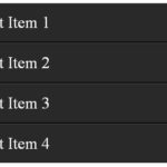
Someone asked me how do I create depth border effect or deep border using lists in CSS. Actually he wanted to create a strand effect (divider) between each list item as you can see in the screenshot below. You can see one more example using light background in rest of the article.
Tag » CSS
Show content on mouseover using CSS
With powerful features of CSS we can show content on mouseover using CSS and we don’t need javascript. Here I have provided two examples, first contains no transition and second has CSS transition effect while hovering. You can see these examples in demo.
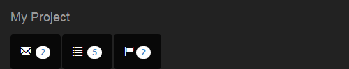
Responsive CSS framework or Bootstrap – navbar breaks on two line – fix
Bootstrap is popular HTML, CSS, and JS framework for developing responsive, mobile first projects on the web. I faced issue of Bootstrap navbar breaks on two line while designing interactive navbar header as you can see in picture below.
Creating a Responsive Multi Column List

In this tutorial we are creating responsive multi column list which maintain predefined number of columns in each row regardless of device size. The last output of our tutorial will be like below with 3 responsive columns in each row. You can easily change it with 2,4,5 or more columns as per your requirement.
In a grid system you can maintain responsiveness where fluid container display grids of images, videos, text, and more. In our article we are doing the same but maintaining number of grids in each row.
Vertically and Horizontally Center a Div
Here is a good solution to make vertically and horizontally center a div inside another div. We also discussed how to center a div in a div either horizontally or vertically later in this article.
IE 8 CSS3 border radius hack in wp site
I am looking for a “working” IE 8 CSS3 border radius hack in wp site. I am using htc file also, I have created a css file in wp theme’s css folder and placed border radious styles there with IE8 hack
Different CSS Shapes

This last part of CSS Shapes will tell you about Different CSS Shapes including Speech Bubble, Heart, Biohazard, Yin Yang, Infinity, Magnifying Glass and TV Shapes.
CSS Shapes – Chart and Ribbon
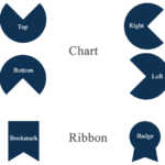
This fifth part of CSS Shapes series covers making Chart and Ribbon using CSS. The Chart is shown in Top, Right, Bottom, Left direction while Bookmark Ribbon and Badge Ribbon are two forms given of Ribbon.
CSS Shapes – Diamond and Star

Diamond and Star shapes can also be formed using CSS. This article will guide you to define CSS properties to create Diamond and Star
CSS Shapes – Square Rectangle Parallelogram Trapezoid and Polygons

We are covering how to create Square, Rectangle, Parallelogram, Trapezoid and Polygons Shapes using CSS here. It’s third part in this series of articles ‘CSS Shapes’.
[ Page 5 of 6 ]