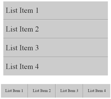
Someone asked me how do I create depth border effect or deep border using lists in CSS. Actually he wanted to create a strand effect (divider) between each list item as you can see in the screenshot:
Depth border effect can be achieved using a little CSS trick which I am going to explain in this tutorial. Let’s start with creating a simple list with HTML markup:

1 2 3 4 5 6 | <ul class="depth-example1"> <li>List Item 1</li> <li>List Item 2</li> <li>List Item 3</li> <li>List Item 4</li> </ul> |
Now add the following CSS rules in your page’s style sheet:
1 2 3 4 5 6 7 8 9 10 11 12 13 | .depth-example1 { font-size: 36px; /* Update size as per your requirement */ list-style-type: none; padding-left: 0; background: #292929; color: white; } .depth-example1 li { padding: 20px; border-bottom: 2px solid black; border-top: 2px solid #3c3c3c; } |
This styling will remove the browser-default padding on the ul, set a background, and apply borders to each li to provide a bit of depth.
To create depth border effect to your lists, apply a border-bottom to each
lithat is a shade or two darker than theli‘s background color. Further, apply a border-top which is a couple shades lighter. It’s the trick to create deep border using lists in CSS.
The only problem to solve is a border will be applied to the very top and bottom of the unordered list which you can see in this zoom below.
 To fix these odds, add the :first-child and :last-child pseudo classes.
1 2 3 4 5 6 7 | .depth-example1 li:first-child { border-top: none; } .depth-example1 li:last-child { border-bottom: none; } |
There we go! now you have a perfect depth border effect or deep border using lists in CSS which I diplayed in beginning of article as image.
If you wish to arrange these list items in horizontal order, use can alter the CSS as per given below:
1 2 3 4 5 6 7 8 9 10 11 12 13 14 15 16 17 18 19 20 21 22 | .depth-example2 { font-size: 20px; list-style-type: none; padding-left: 0; color: white; } .depth-example2 li { padding: 20px; float: left; background: #292929; border-right: 2px solid black; border-left: 2px solid #3c3c3c; } .depth-example2 li:first-child { border-left: none; } .depth-example2 li:last-child { border-right: none; } |
We have just moved background from unordered list to list items and border-top and border-right are replaced with border-left and border-right respectively. And the output is:
 Create depth border effect or deep border using lists in CSS (Light background):
I have written an example of the same using light background color. Check the CSS to obtain the same as shown in screenshot below:
 And the CSS rules are:
1 2 3 4 5 6 7 8 9 10 11 12 13 14 15 16 17 18 19 20 21 22 23 24 25 26 27 28 29 30 31 32 33 34 35 36 37 38 39 40 41 42 43 44 45 46 47 | /* Vertical list */ .depth-example3 { font-size: 36px; /* Update as requirement */ list-style-type: none; padding-left: 0; background: #CCC; color: #333; } .depth-example3 li { padding: 20px; border-bottom: 2px solid #999; border-top: 2px solid #DBDBDB; } .depth-example3 li:first-child { border-top: none; } .depth-example3 li:last-child { border-bottom: none; } /* Horizontal list */ .depth-example4 { font-size: 20px; list-style-type: none; padding-left: 0; color: #333; } .depth-example4 li { padding: 20px; float: left; background: #CCC; border-right: 2px solid #999; border-left: 2px solid #DBDBDB; } .depth-example4 li:first-child { border-left: none; } .depth-example4 li:last-child { border-right: none; } |