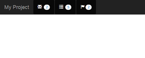
Bootstrap is popular HTML, CSS, and JS framework for developing responsive, mobile first projects on the web. I faced issue of Bootstrap navbar breaks on two line while designing interactive navbar header as you can see in picture below.

And html markup for that is:
1 2 3 4 5 6 7 8 9 10 11 12 13 14 15 16 17 18 19 20 21 22 23 24 25 | <nav role="navigation" class="navbar navbar-inverse navbar-fixed-top"> <!-- container-fluid --> <div class="container-fluid"> <!-- navbar-header --> <div class="navbar-header"> <button data-target="#navbar-top" data-toggle="collapse" class="navbar-toggle" type="button"> <span class="sr-only">Toggle navigation</span> <span class="icon-bar"></span> <span class="icon-bar"></span> <span class="icon-bar"></span> </button> <a href="#" class="navbar-brand">My Project</a> <ul class="nav navbar-nav nav-pills"> <li class="active"><a href="#"><span class="glyphicon glyphicon-envelope"></span> <span class="badge">2</span></a></li><li class="active"><a href="#"><span class="glyphicon glyphicon-list"></span> <span class="badge">5</span></a></li><li class="active"><a href="#"><span class="glyphicon glyphicon-flag"></span><span class="badge">2</span></a></li> </ul> </div> <!-- /navbar-header --> <!-- nav-collapse --> <div class="navbar-collapse collapse" id="navbar-top"> ... </div> <!-- /nav-collapse --> </div> <!-- /container-fluid --> </nav> |
This issue comes across almost all the popular responsive CSS framework like PURE or any other grid system on webkit browsers and IE. Fortunately there is a simple code to fix this. Add the following CSS to your site’s stylesheet.
1 2 3 4 | .navbar-header > a { float: left; } |
This CSS rule means we are applying the float: left style to all a tags that are children (immediate descendant) of navbar-header class. So the rule will be applicable to <a href="#" class="navbar-brand">My Project</a>.
You can modify the CSS according to class/id name in your page to fix Bootstrap navbar breaks and final look will be:
