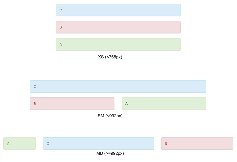
So you want to change the layout of your Bootstrap website and reorder columns in small screens or mobile devices for better accessibility and readability. The Bootstrap pull and push classes are there to let you change them or re-order divs while maintaining responsiveness.
There are plenty of examples on Google with different arrangement to organize the order with different viewport sizes but none of them actually clears the concept of using pull and push classes nicely to render desired ordering. So I decided to write this article to let people understand the concept behind columns reordering in small screens or mobile devices.

Reorder columns in small screens or mobile devices
Starting with an easiest example we wish to appear columns in the following order and we will write & explain code for them later.
First of all the right approach to work with twitter bootstrap is think about mobile layout first and arrange columns accordingly. So as we want to appear B above A in smallest screens or mobile devices, we created html code as below:
1 2 3 4 5 6 7 8 | <div class="row"> <div id="B" class="col-sm-8"> <div class="alert alert-info">B</div> </div> <div id="A" class="col-sm-4"> <div class="alert alert-danger">A</div> </div> </div> |
This code will render output same as mobile layout (<768px) in picture illustrated above. Next is the formula. We want to pull column A to left of B so first we need to push B to accommodate space equivalent to width of A (col-sm-4) and then pull A to equivalent width of B (col-sm-8). So our code with pull and push classes will be as:
1 2 3 4 5 6 7 8 | <div class="row"> <div id="B" class="col-sm-8 col-sm-push-4"> <div class="alert alert-info">B</div> </div> <div id="A" class="col-sm-4 col-sm-pull-8"> <div class="alert alert-danger">A</div> </div> </div> |
So the idea is quite simpler:
- Write code for columns same as you with to appear them in lowest size.
- Push first column (B) to equal size of second column (4 in A) and pull second column A to equal size of first column (8 in B).
Writing with keeping mobile first in mind will help you to have less classes, cleaner approach and slip free layout rendering as in our example, A will always be to the left of B in all devices with minimum width of 768px and we did not use col-md-* or col-lg-* anywhere.
3 columns re-ordering or change stacking order
Here is one more example mostly when we use 2 sidebars.
The layout is self explanatory as well. Starting from mobile screen, our code will be:
1 2 3 4 5 6 7 8 9 10 11 | <div class="row"> <div id="C" class="col-md-6"> <div class="alert alert-info">C</div> </div> <div id="B" class="col-sm-6 col-md-4"> <div class="alert alert-danger">B</div> </div> <div id="A" class="col-sm-6 col-md-2"> <div class="alert alert-success">A</div> </div> </div> |
For a good approach, keep sum of columns of each type equal to or divisible by 12. In our case, it is (sm-6 + sm-6 = 12) and (md-6 + md-4 + md-2 = 12). Now reordering columns:
1 2 3 4 5 6 7 8 9 10 11 | <div class="row"> <div id="C" class="col-md-6 col-md-push-2"> <div class="alert alert-info">C</div> </div> <div id="B" class="col-sm-6 col-md-4 col-md-push-2"> <div class="alert alert-danger">B</div> </div> <div id="A" class="col-sm-6 col-md-2 col-md-pull-10"> <div class="alert alert-success">A</div> </div> </div> |
Now want to calculate how to use push and pull classes to obtain the above re-ordering? It’s simpler than your expectation. Size of last div (A) is equal to 2 columns so each div above it (C and B) has to be pushed exactly two columns which we have done using col-md-push-2 in first and second divs each. Further these two columns (C+B) has total width equal to 10 so last div should have to be pulled by 10 columns to order it at extreme left in viewport size >= 992px. Very nice!!
So now you have all the understanding to nicely use Bootstrap’s pull and push classes to reorder columns in small screens or mobile devices and I hope it will sure benefit you to make desired layout in different screen sizes.
